

Diligent
Helping Organizations Turn ESG Data into Actionable Insights

Project background
At Diligent, a platform helping organizations manage risk and governance, I designed an ESG analytics dashboard to make complex sustainability data clear and actionable for corporate teams.
Problem:
ESG reporting tools were fragmented and hard to interpret, leaving sustainability and compliance teams struggling to compare metrics or track progress across environmental, social, and governance goals.
Goal:
Create a unified dashboard that visualizes ESG performance data in a way that’s transparent, comparable, and easy to act on—helping organizations identify risks, benchmark progress, and report with confidence.
Results:
The new system reduced time to insights for ESG teams and established a scalable design foundation for future data visualization tools.
Role: Lead Product Designer | Duration: 3 months | Team: Product Manager, Engineers, Data Analysts
User research
I started with user research, interviewing directors to gauge their interest in ESG as a feature in our product.
“The Health Score is interesting but I don’t understand how it works. What does plus/minus mean.” - Research participant
What is ESG
ESG stands for Environmental, Social, and Governance, a framework work used to assess a company's sustainability and ethical impact beyond traditional financial metrics.
How might we help organizations visualize and compare ESG performance data so teams can identify risks, benchmark progress, and report with confidence?
Data tables. Scores and Stories
I worked with a data science team; they used a tool to track ESG stories and scores. My job was to translate complicated and hard to distill data tables into easy to use dashboard.
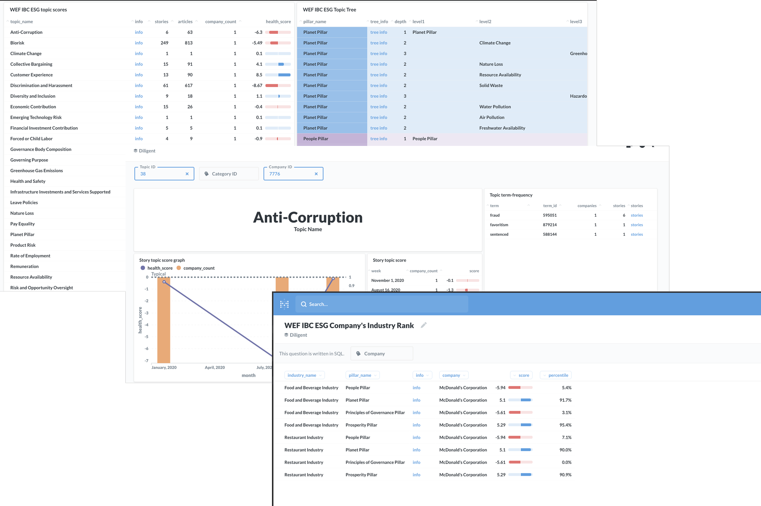
Exploring UI
These are some of the ui and visual explorations based on user interviews and collaboration with the data science team.
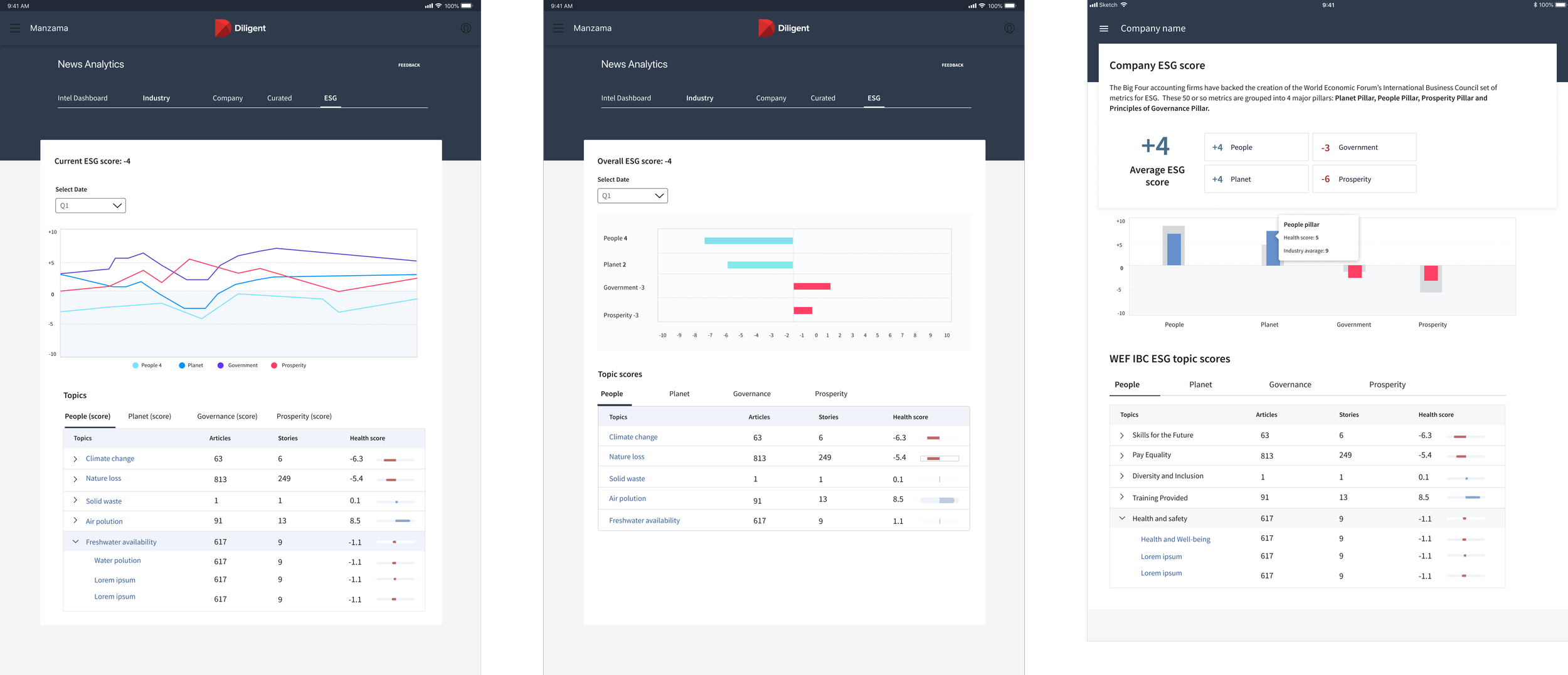
Final designs
User interviews and collaboration with data teams led to a dashboard displaying a company's ESG score based on relevant articles.
Companies can also compare their scores with competitors, with scores linked to news articles tracked on the dashboard.

How did it solve the user problem?
“I want to feel more informed on current topics and how people are perceiving current events about my company.”
“Gain insights and use that in some way to predict the future to make more informed decisions.”
The dashboard displays company perception and news articles to keep CEO’s informed about current events.