
Helping organizations turn ESG data into actionable insights
B2B
SaaS
AI
UX
Data Vizualization
I led the end-to-end design of the AI-powered ESG dashboard, defining the information architecture, data visualizations, and interactions in close collaboration with product, engineering, and data science.
Problem:
Public companies are increasingly judged on ESG performance, but leaders lack a clear, timely way to understand how their company is being perceived across ESG pillars. ESG data is fragmented, slow, and difficult to interpret, making it hard for executives to identify emerging risks, benchmark against peers, or act before issues escalate.
Goal:
Create a clear, trustworthy ESG experience that translates complex news and signals into an actionable ESG Health Score, helping executives quickly understand risk, track trends over time, and make informed decisions with confidence.
Outcome:
Post-launch metrics showed a 20% increase in user engagement, reflecting improved clarity and relevance of ESG information for executive users.
My role: Lead Product Designer
Timeline: 2 weeks
Team: Designer, Product Manager, Engineer & Data Scientist
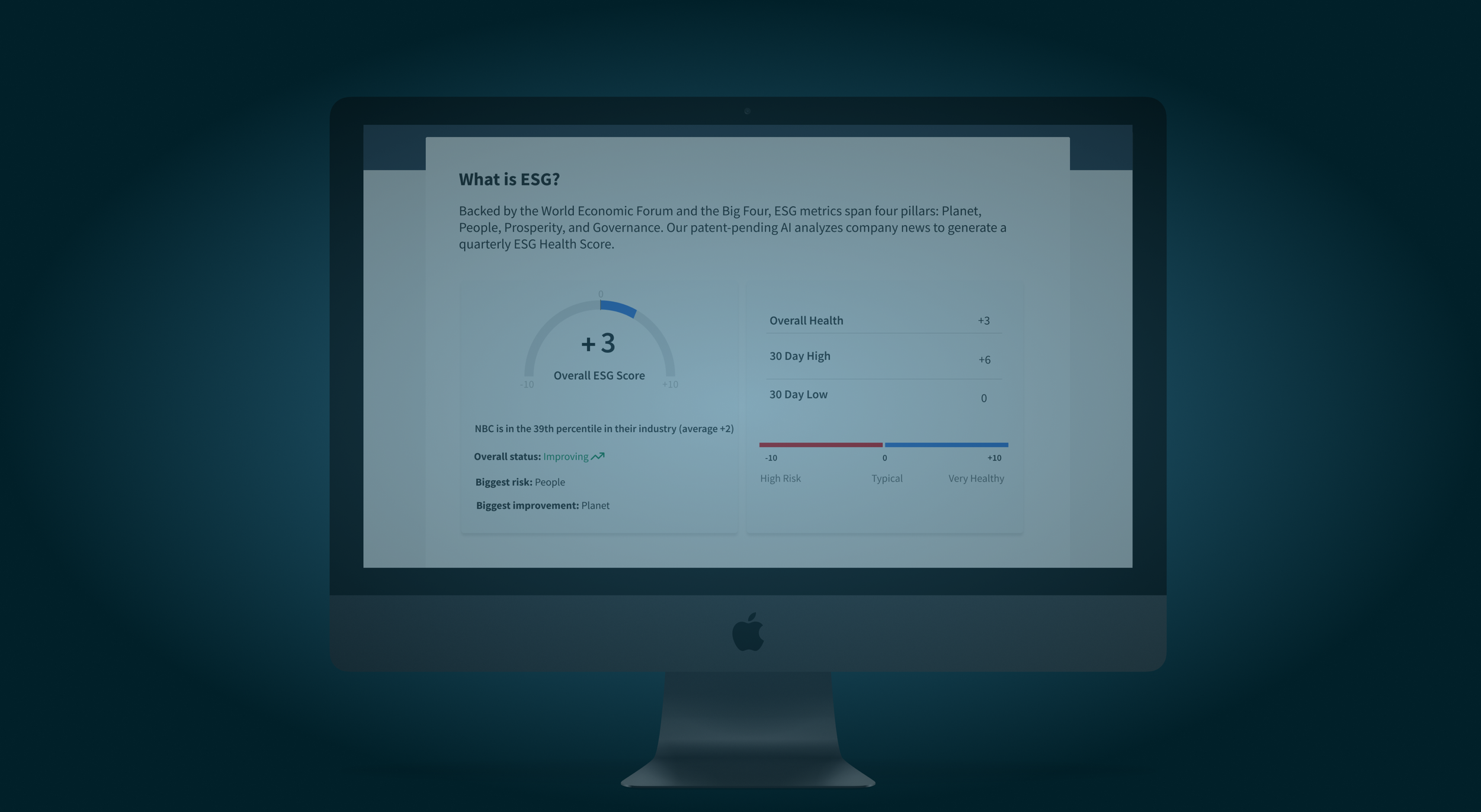
What is ESG?
ESG stands for Environmental, Social, and Governance, a framework used to assess a company's sustainability and ethical impact beyond traditional financial metrics.
How might we help organizations visualize and compare ESG performance data so teams can identify risks, benchmark progress, and report with confidence?
User research
User research highlighted confusion around ESG scores and a lack of trust in how they were derived, reinforcing the need for clear signals, trend context, and transparent links to underlying news.
“The Health Score is interesting but I don’t understand how it works. What does plus/minus mean.” - Research participant
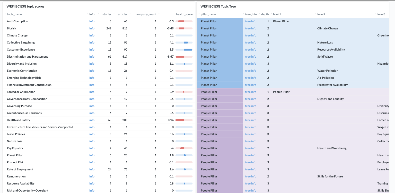
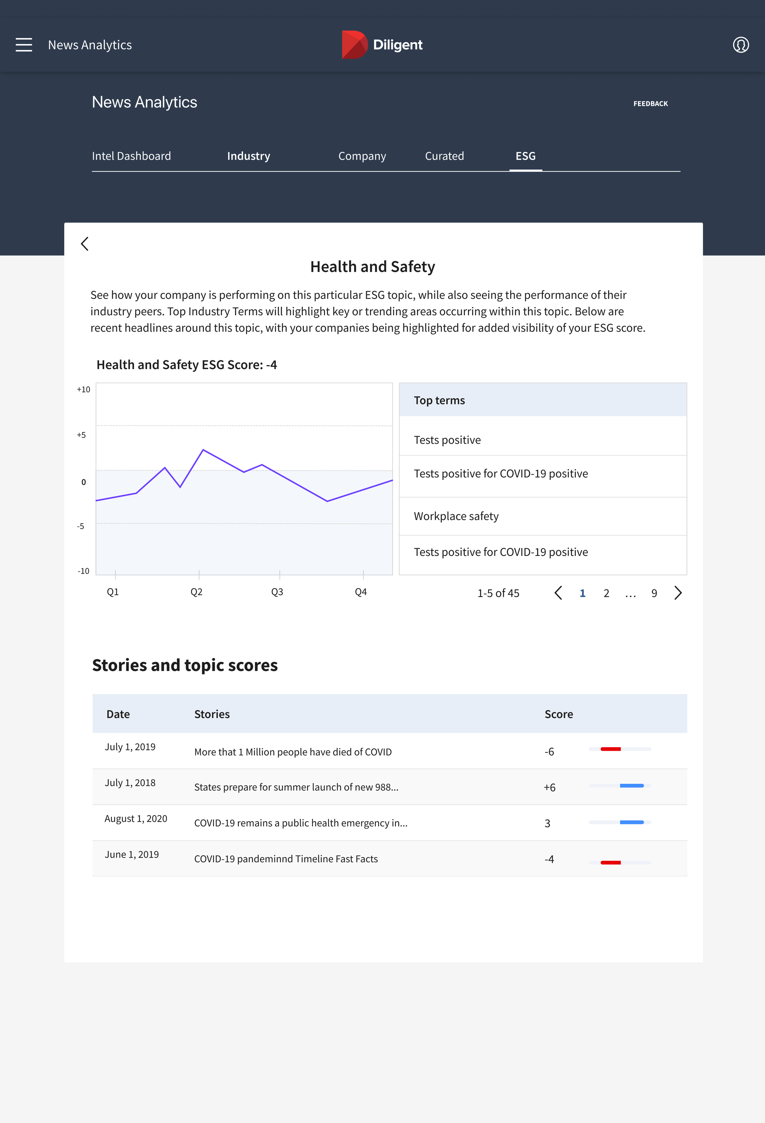
Data tables, Scores & Stories
I worked with a data science team; they used a tool to track ESG stories and scores. My job was to translate complicated and hard to distill data tables into easy to use dashboard.
These findings from research shaped our problem statement:
How might we make an ESG dashboard meaningful for directors and CEO’s?
Exploring UI
I explored a few different directions of the dashboard based on the user interviews, competitive analysis, and best practices.
The goal for these iterations was to design a dashboard that helps directors understand their ESG score and why it matters.
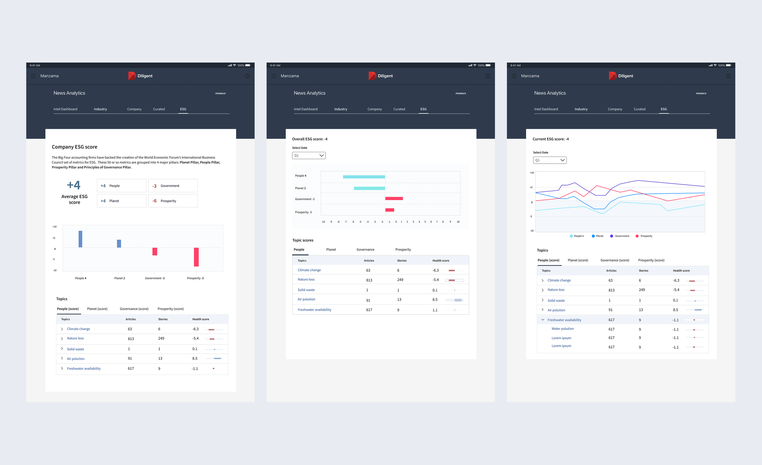
What I learned from testing early iterations?
Users wanted more information on the ESG of their company and how and why it changes over time. Based on these findings, I worked with the team to add more detailed review.
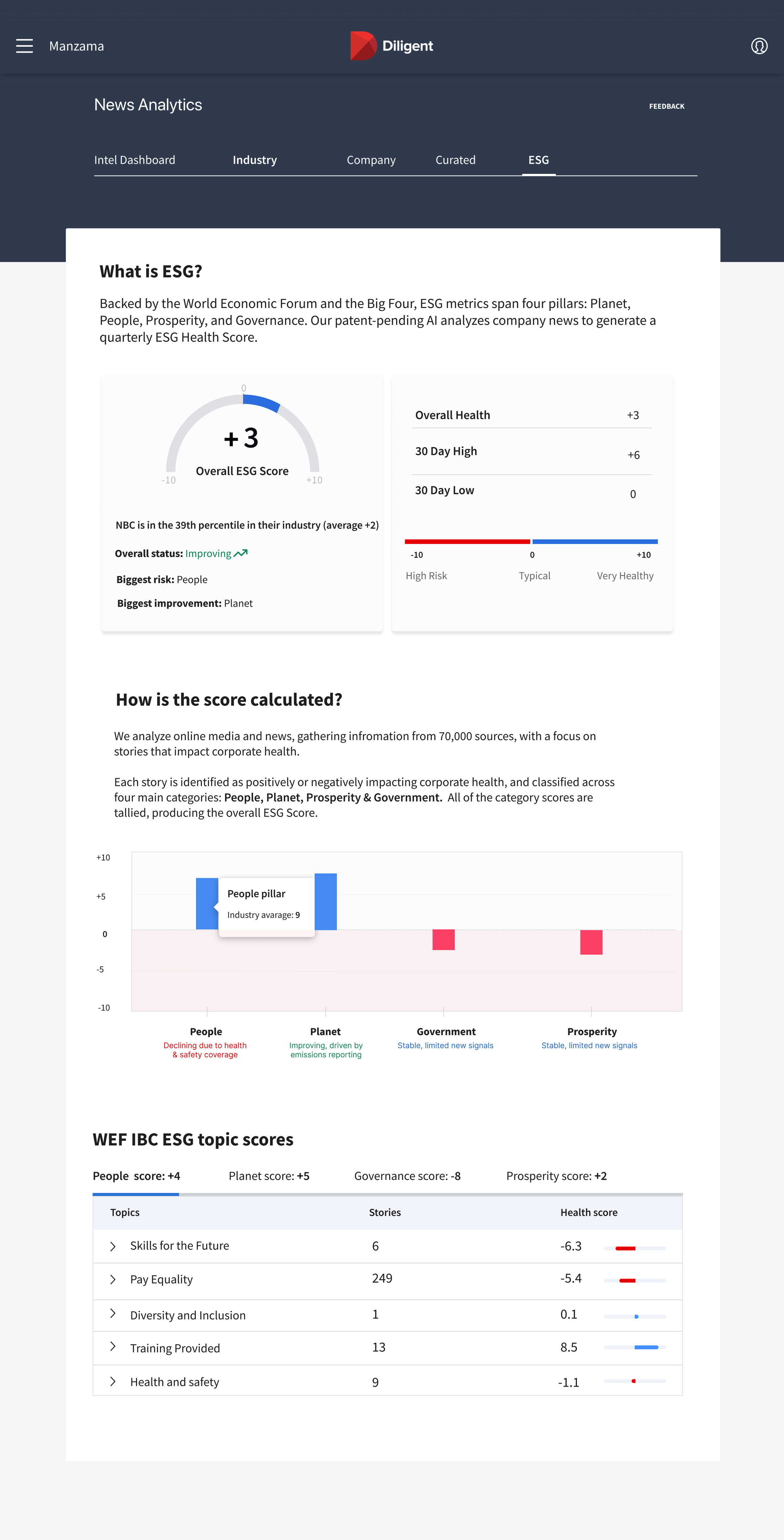
Final designs
User interviews and collaboration with data teams led to a dashboard displaying a company's ESG score based on relevant articles.
Outcomes
Outcomes and Results
Increased user engagement by 20% following launch, driven by clearer ESG signals and improved interpretability
User Impact
Enabled executives to identify ESG risks and trends more quickly through a unified score, pillar breakdowns, and news-driven context.