

Amazon Prime Video MGM+
Building trust through transparency: streamlining the cancellation journey
Project background
At Amazon Prime Video MGM+ (formerly EPIX), I led the redesign of the platform’s subscription management experience, a critical flow where users upgrade, downgrade, cancel, or permanently delete their accounts.
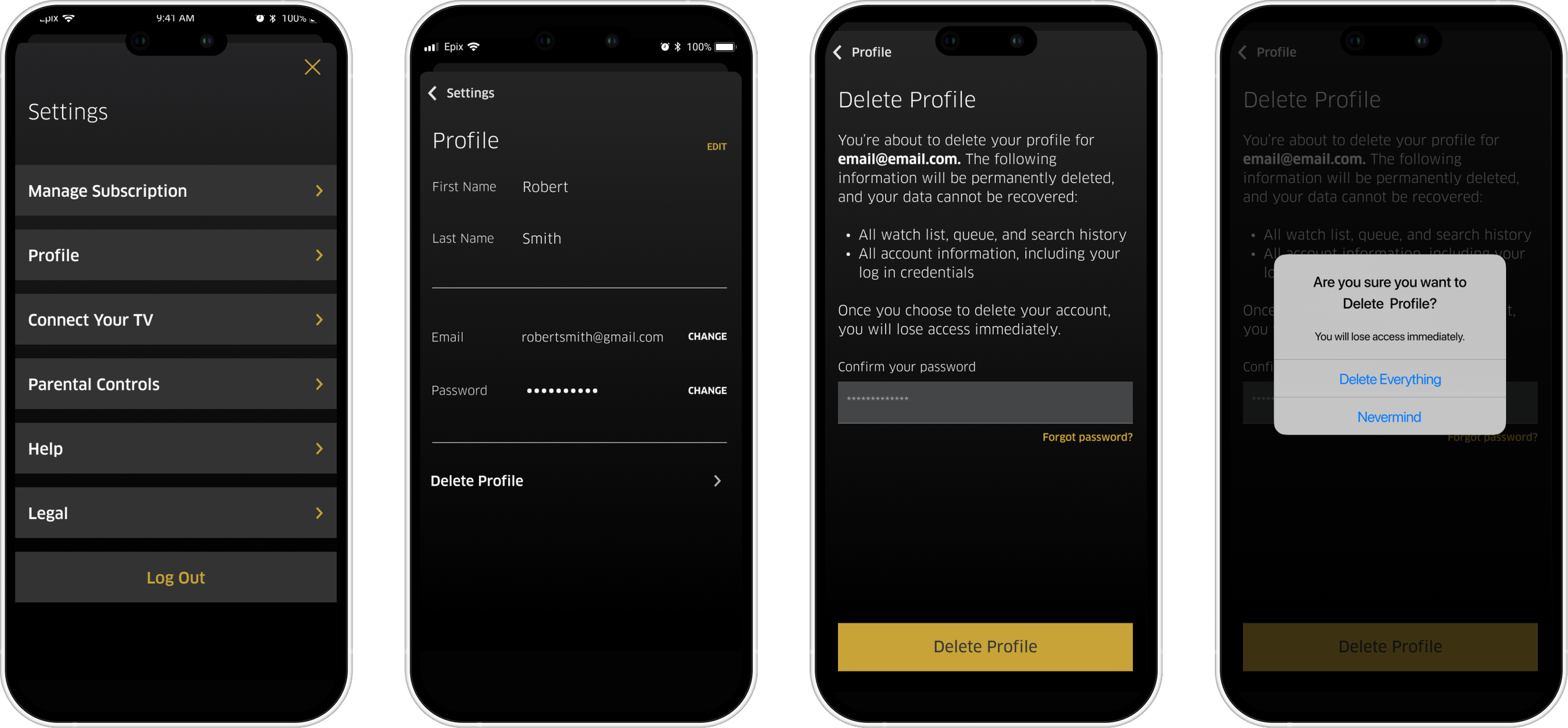
Problem: Apple’s App Store policies require subscription cancellation and account deletion to remain separate actions. Users frequently assumed one action covered both, leading to confusion, accidental cancellations, and a high volume of support requests.
Goal: Create a clear, compliant, and trustworthy experience that helps users confidently manage their subscription, whether they’re changing plans or fully leaving the platform, while reducing friction and support overhead.
Outcome: After launch, customer support calls related to cancellations and account deletion dropped by 400%, significantly reducing operational cost and improving overall user trust in the platform.
When subscribers had trouble managing their accounts, support calls skyrocketed.
We redesigned the user experience to make billing and account management transparent, simple, and trustworthy.
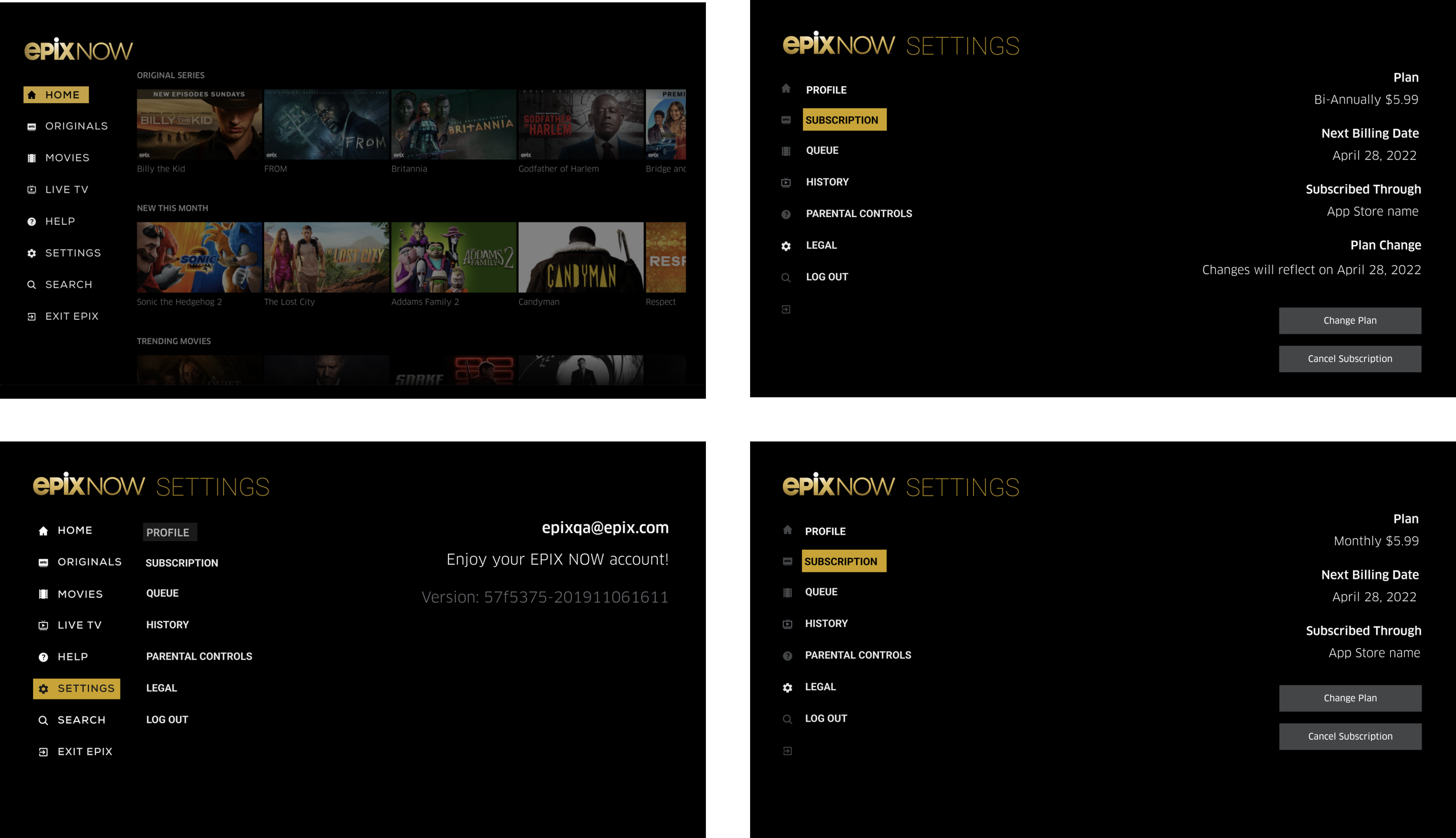
Features covered: Delete account, cancel subscription, upgrade, and downgrade plan.
Platforms: iOS, Android (mobile and tablet), Web, and TV (Apple and Android TV).
First steps
User testing
Methods: unmoderated user testing using UserZoom
Goal: Determine whether users understood that canceling a subscription and deleting an account are two separate journeys

User testing feedback
What do you think is going to happen if you tap on delete your account button?
69% of participants said:
My account will be deleted, and my subscription will be canceled
Based on this feedback, it was clear that research participants did not understand that cancel subscription and delete account were not separate journeys.
“I expect that my subscription will be canceled immediately.”
- Research participant
“It’s silly to delete an account without canceling the part you pay for.”
- Research participant
“I’m confused why I would delete my account and not cancel it.”
- Research participant
These findings shaped our problem statement:
How might we make the process of canceling a subscription or deleting an account clear, effortless, and frustration-free for users?
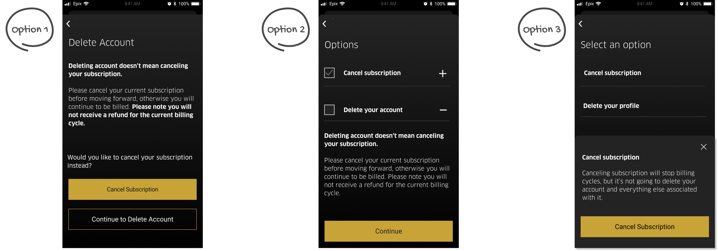
Iterating based on user feedback
Refined flows and content based on usability insights to improve clarity and reduce friction.
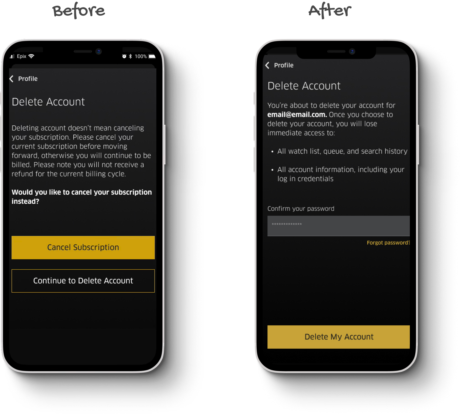
Proposing an alternative solution
I proposed renaming “Account” to “Profile” and moving it within the profile section to make navigation more intuitive and consistent with user expectations. This iteration was then tested with users.
Testing iterations
I tested this iteration to identify any confusion points and evaluate how users responded to the new approach.
“I felt that I knew exactly what to do when it came to canceling the subscription and profile; it was very easy and straightforward.”
- Research participant
“I believe it is all very user-friendly and self-explanatory. It tells you in great detail what canceling and deleting profile means.”
- Research participant
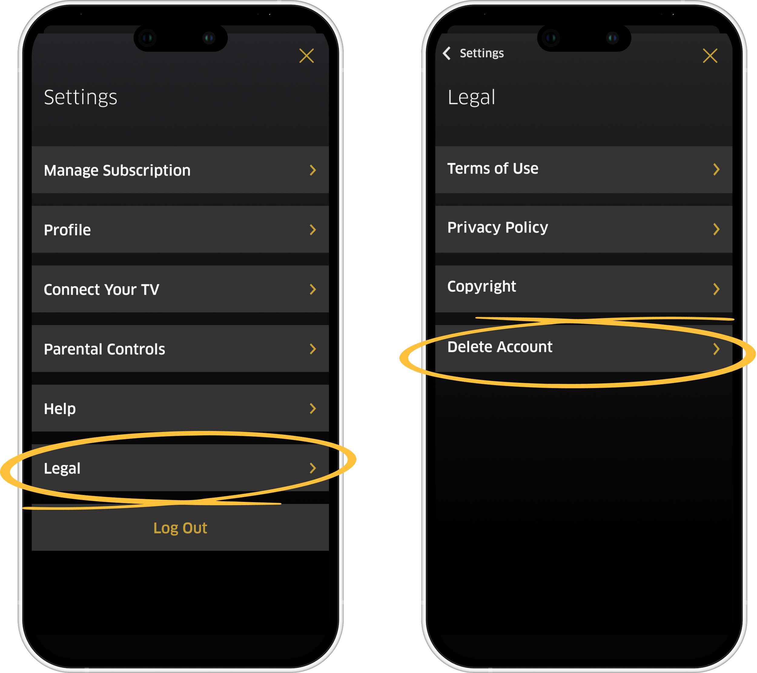
Feedback was positive, users found the flow clear and intuitive. Due to Apple’s compliance rules, we moved the delete profile option under Legal to maintain clarity while adding necessary friction.
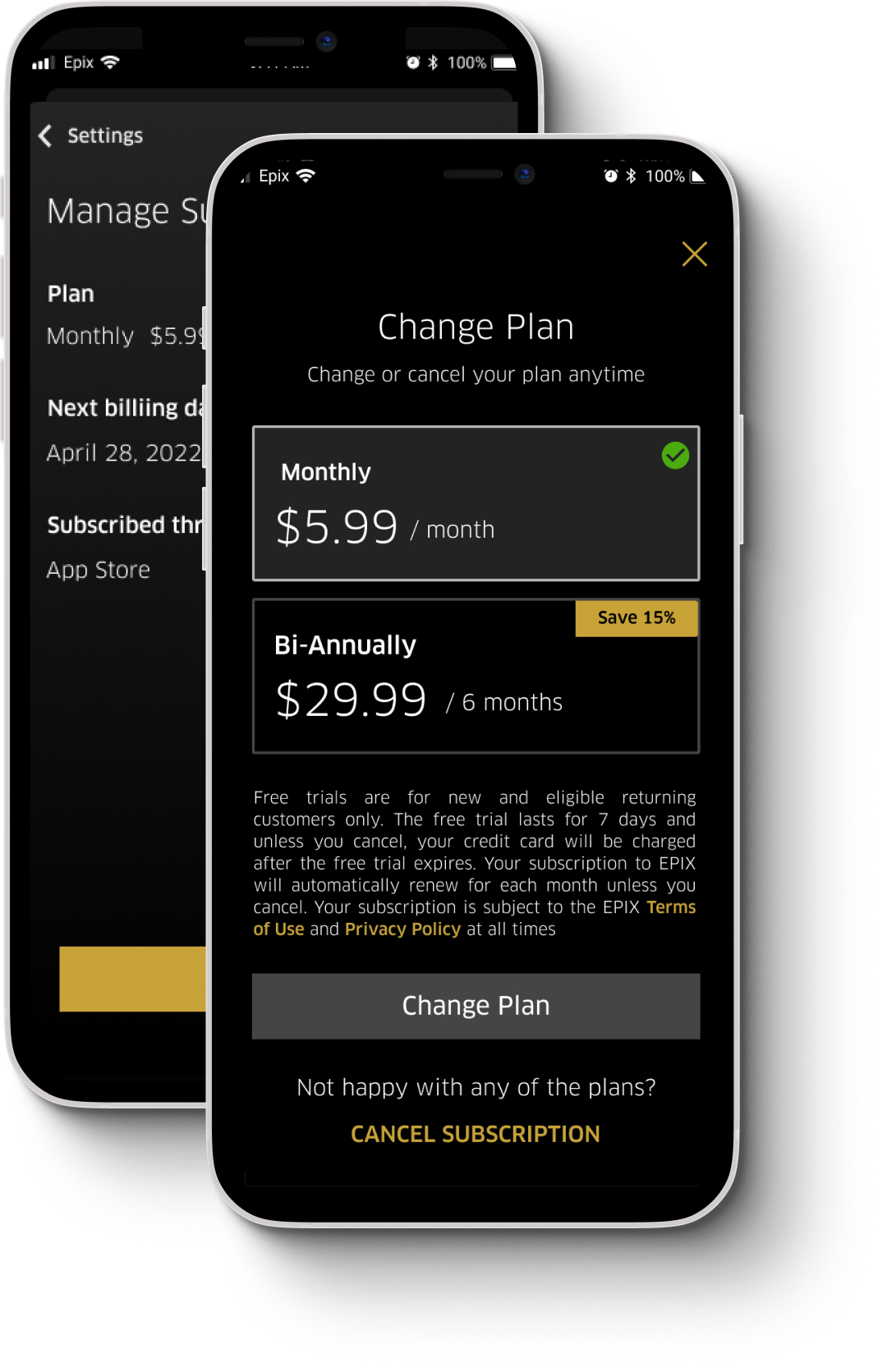
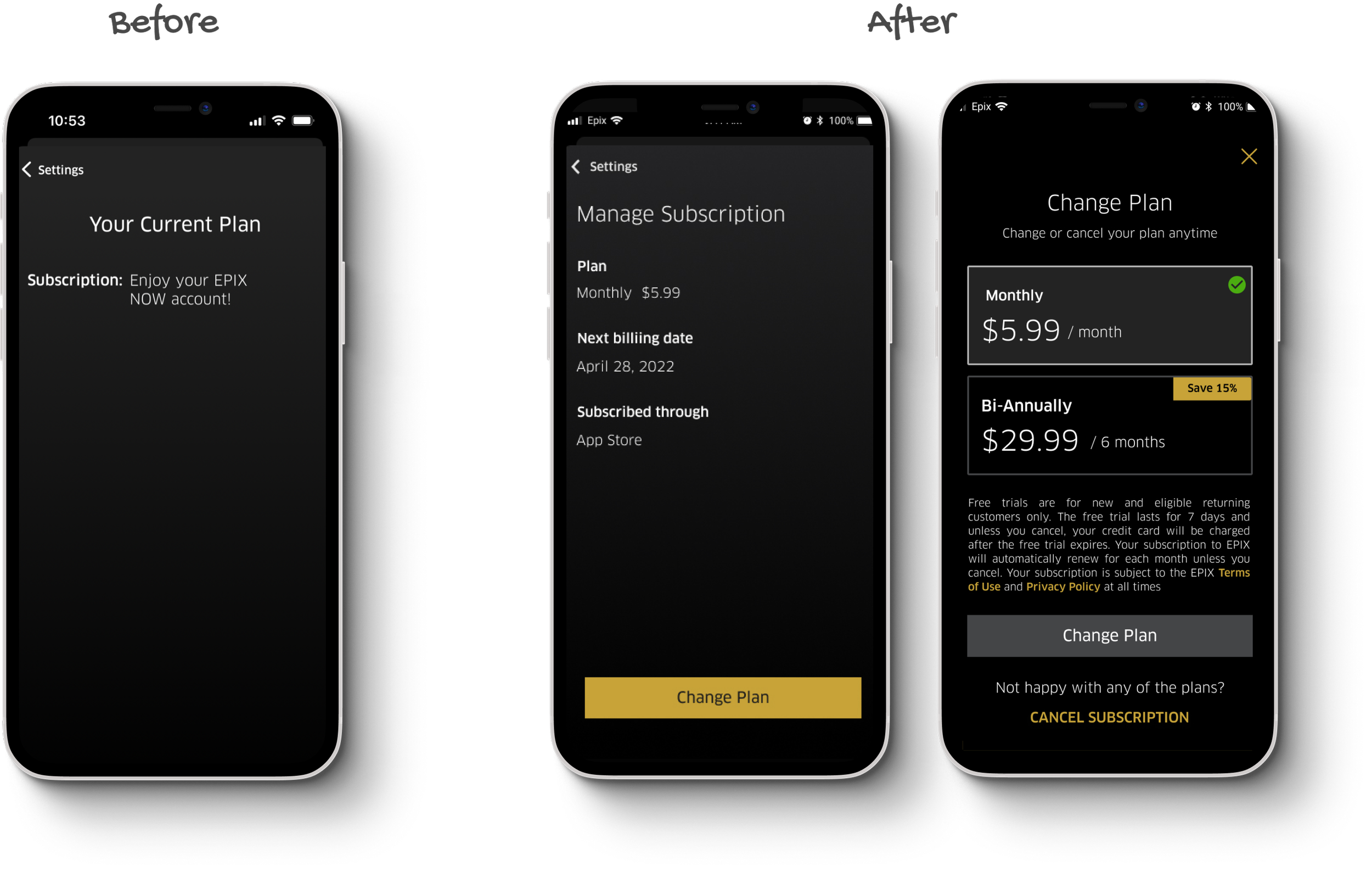
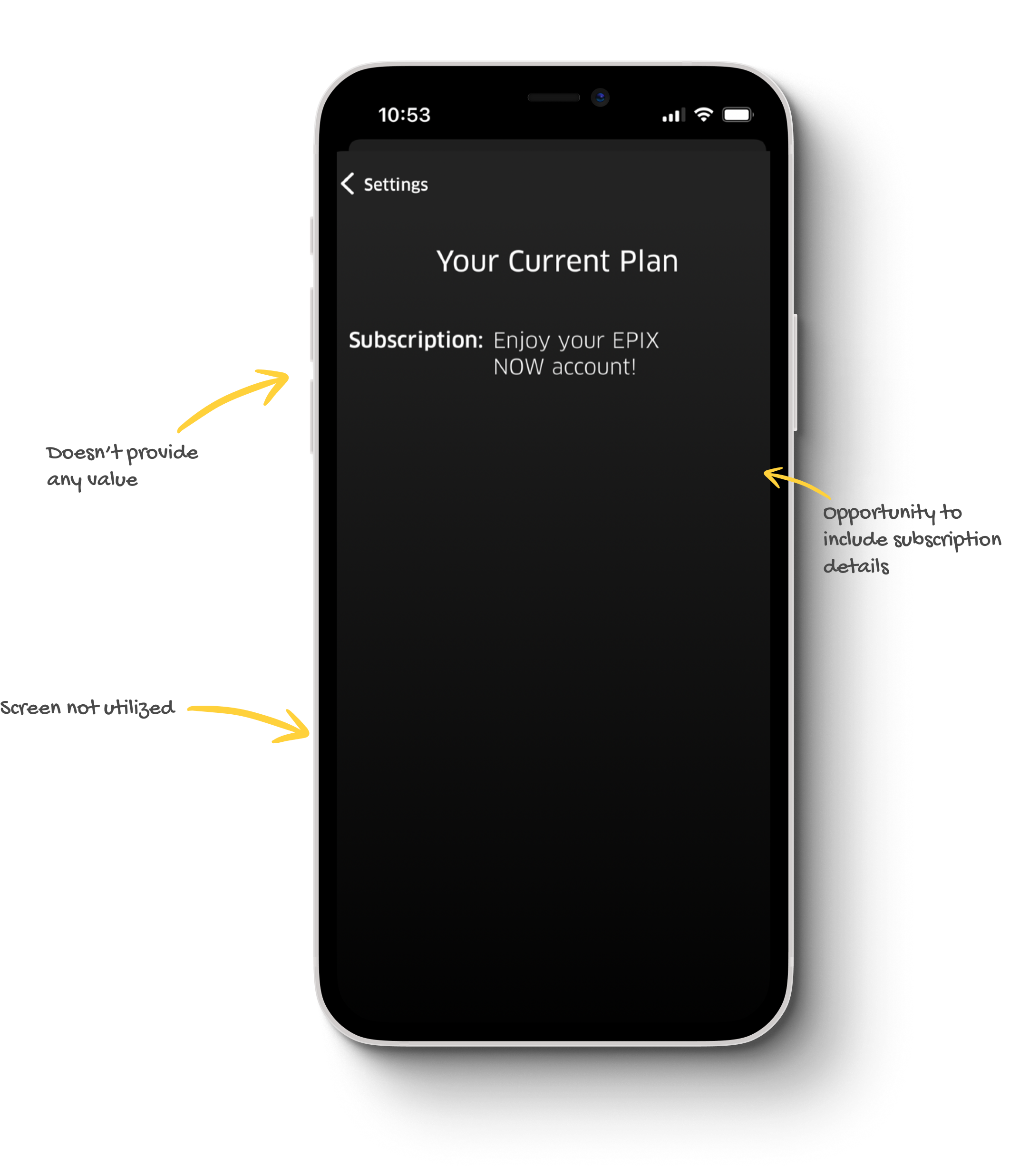
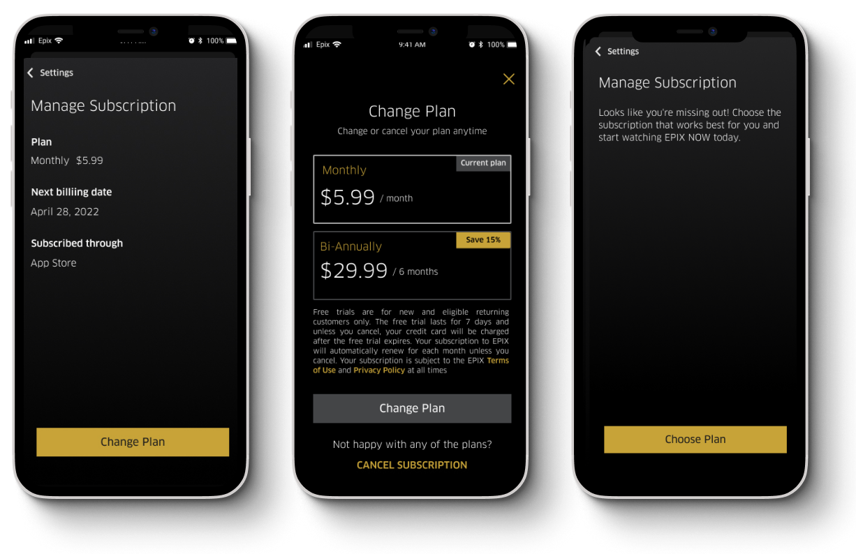
Making managing subscription more meaningful
The original screen provided basic functionality but lacked clarity and context.
Exploring and testing iterations
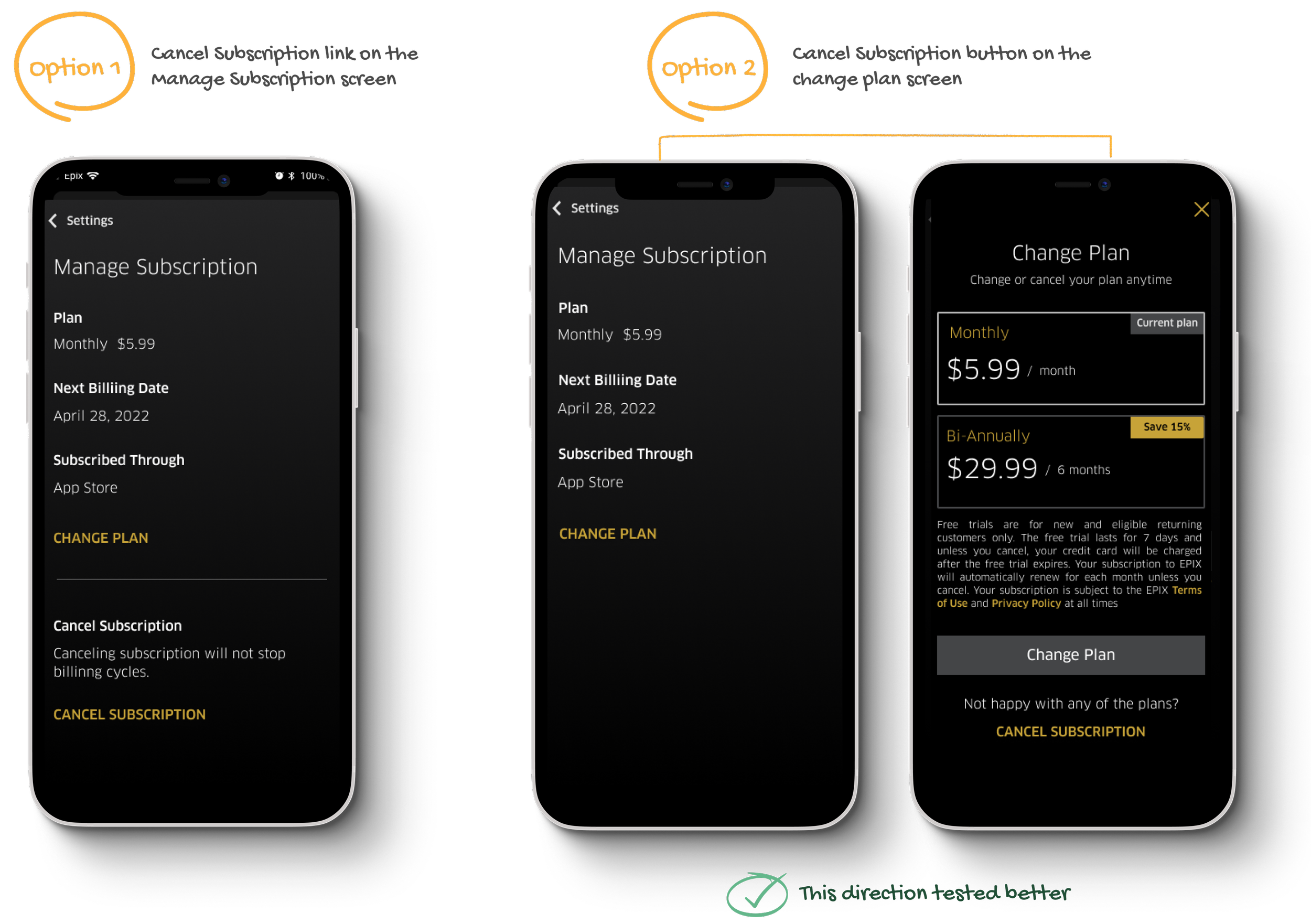
I conducted an A/B test to understand which design resonated better with users.
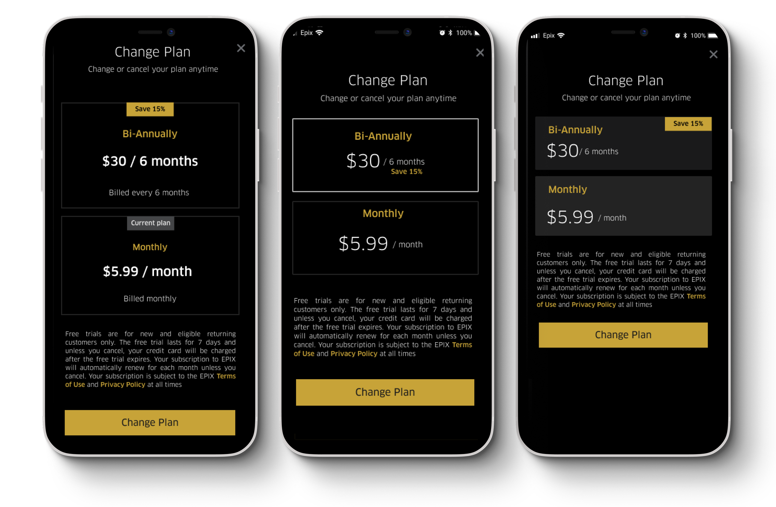
Iterating on final designs
Refined layouts and interactions based on user feedback to improve clarity and align with the product’s visual language.
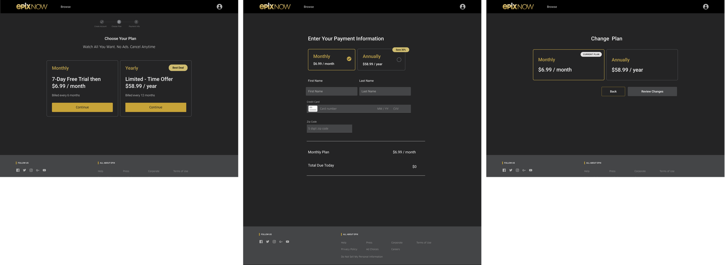
Adding more subscription plans
Exploring subscription cards
In exploring how to present multiple subscription options, I tested both horizontal and vertical card layouts. The vertical approach proved easier for users to scan and compare. Feedback also showed a desire to view the current plan within the “Change Plan” screen.
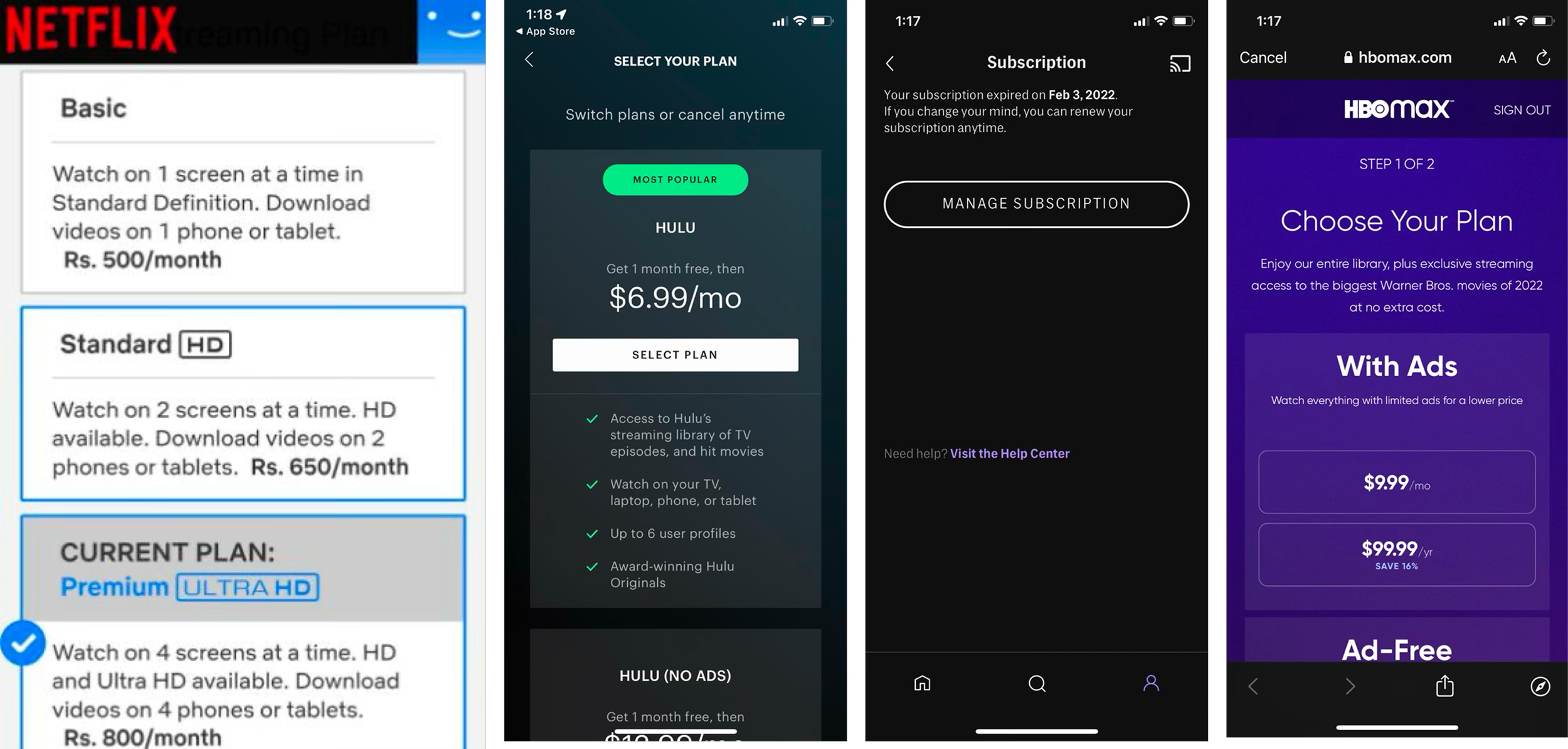
Competitive analysis
I conducted a competitive analysis to understand how other companies designed their plan change journeys specifically and identified best practices to improve clarity and user control.
Looking at competitors
Validating designs
Feedback was largely positive, though some users noted that low contrast made it difficult to distinguish the selected card.
User testing

“It was very simple. I don’t think there was anything that I would like to see changed. In fact, I would say it was easier than most.”
- Research participant
“I would make my current plan easier to notice. I would highlight it with a colorful border.”
- Research participant
Iterating based on user feedback
Feedback was largely positive, though some users noted low contrast on the cards, making it difficult to tell which one was selected.
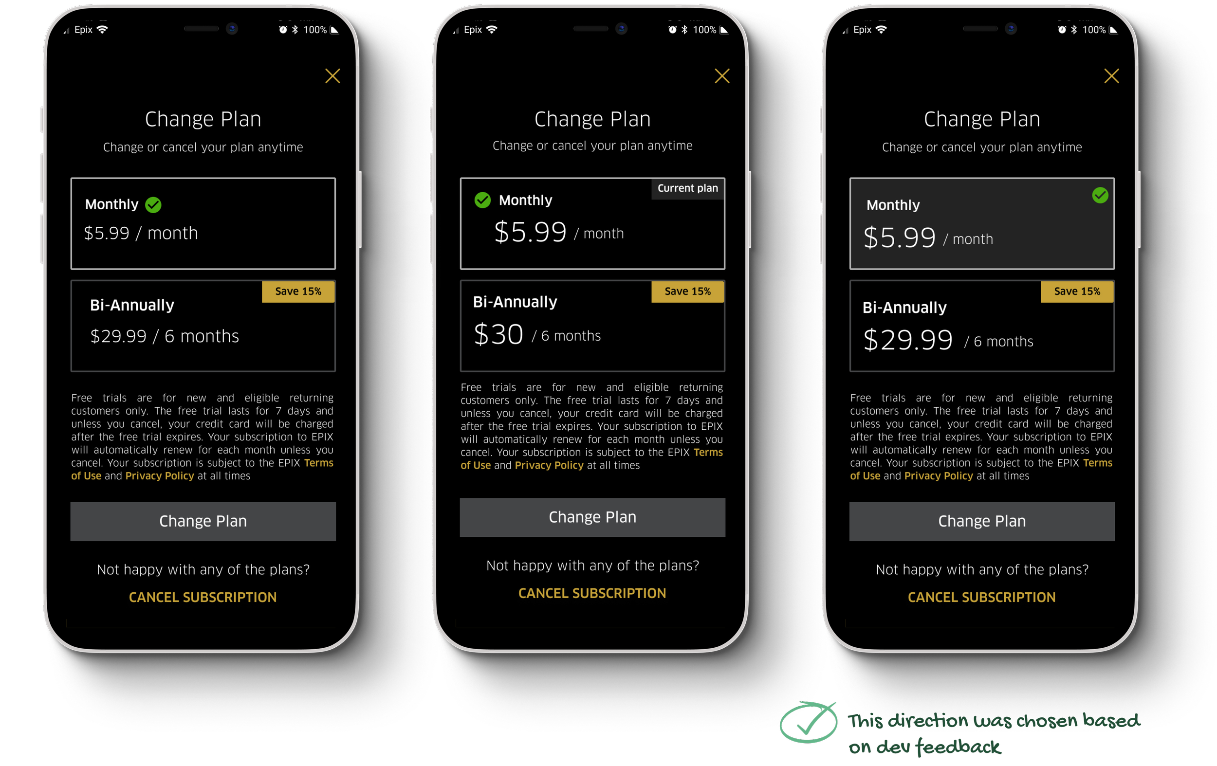
Validating final designs
I conducted final user testing to validate the latest updates, and feedback was overwhelmingly positive.
“I think the experience made a lot of sense. The settings options had all the items I would expect.”
- Research participant
Final outcome
Refined visual hierarchy and accessibility. Increased card contrast and added motion feedback for clearer selection. Adjusted typography and spacing for readability.


Other platforms
Since Epix is a streaming service, I designed it for multiple platforms, including iOS and Android (mobile and tablet), the Web, Apple TV, and Android TV.
Web
Apple TV

Android TV
Outcomes and Results
Customer support calls related to cancellations and account deletion dropped by over 400% after launch.
User Impact:
Users described the new offboarding flow as clear, respectful, and easy to navigate. Transparency around subscription status and next billing dates reduced confusion and frustration.
Business Impact:
The redesign significantly lowered support costs and improved user trust metrics. Simplifying account deletion also strengthened alignment with compliance and brand perception, reducing legal risk and increasing retention among re-subscribing users.